ART DIRECTION → Branding, Print
CLIENT → Rika Moto
YEAR → 2018
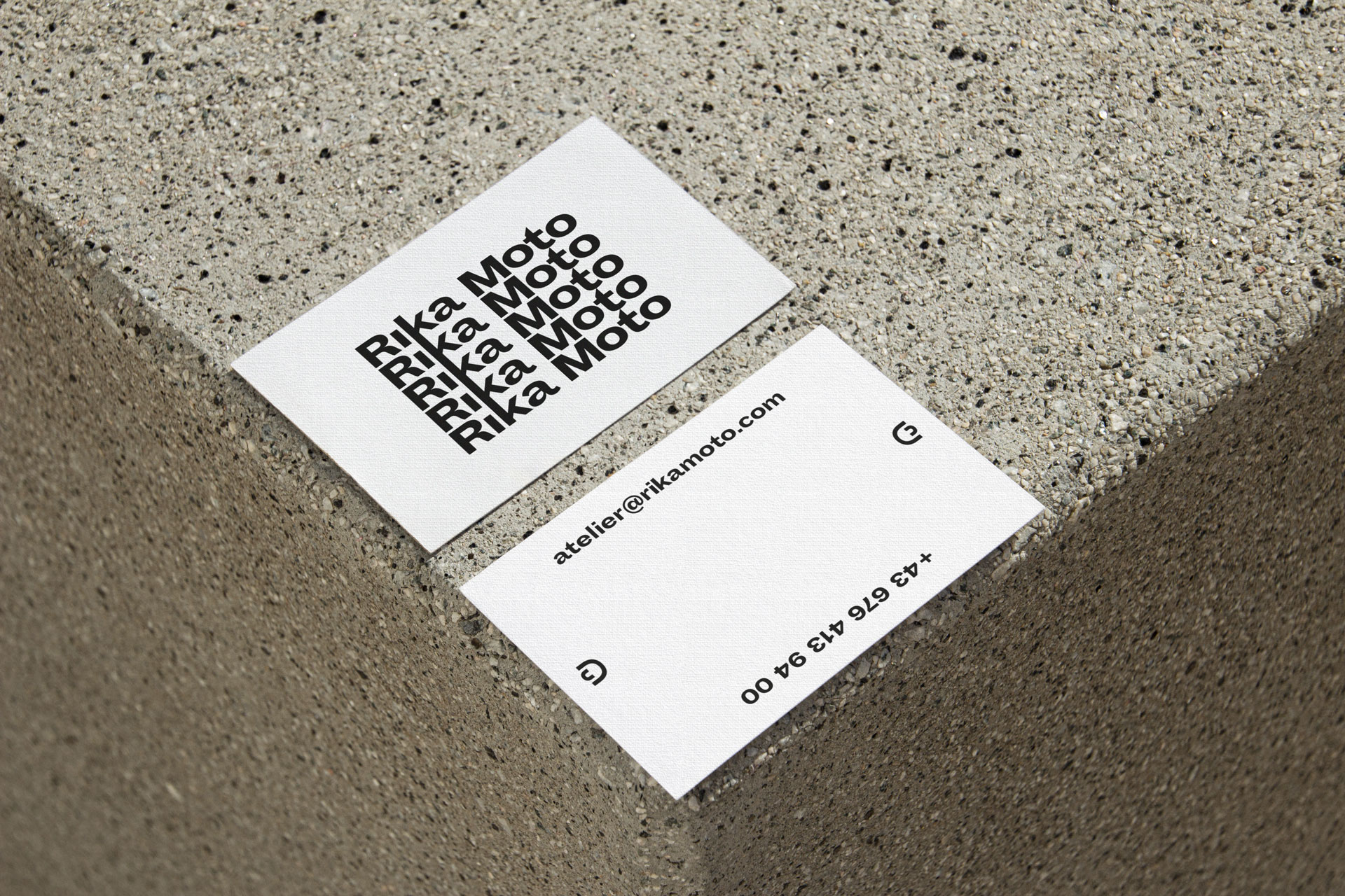
The branding for Rika Moto is clean and minimal, reflecting her sculptural work with simple, elegant design elements. The approach emphasizes clarity and modernity, mirroring her artistic exploration of form and material. The design focuses on subtlety, conveying the balance between art and precision that defines her unique practice.